A container which can be used to hold a tabular or hierarchical set of rows of elements. The tree may contain any number of rows and any number of columns. Each row of the tree may contain child rows which are displayed indented from the parent. Unlike other elements, the data to display inside the tree is not specified using tags, but is determined from a view object. The view object implements the nsITreeView interface. The view is queried for the data to appear in the tree. There are several ways in which trees are used, as listed below. The second column lists the interfaces available via the tree's view property. The third column indicates whether treeitem element are used.
If you would like to allow the tree to be horizontally scrolled, simply set the width attributes for each column to make the tree wider than its containing object.
| Tree type | View interfaces | Has DOM nodes? | Description |
|---|---|---|---|
| Content tree | nsITreeView, nsITreeContentView | Yes | This tree has treeitem elements placed within the treechildren element. In this situation, a content view (which implements the interface nsITreeContentView) which is a more specialized type of view, uses the treeitem elements and their descendants to determine the data to display in the tree. However, the treeitems are not displayed directly; they are used only as data to the content view. However, the content view will automatically update the tree if treeitems are changed. |
| RDF tree | nsITreeView, nsIXULTreeBuilder | No | This tree is generated from an RDF datasource. It is used when a tree has a datasources attribute, and has dont-build-content in its flags attribute. For this tree, the data comes directly from the RDF datasource. DOM treeitems are not created. Even though the template uses treeitem elements to define the content, DOM nodes for these elements are not created. This is the type that should be used for RDF generated trees with lots of rows. |
| RDF content tree | nsITreeView, nsIXULTreeBuilder, nsITreeContentView | Yes | This tree is generated from an RDF datasource. It is similar to the previous type but is used when the tree does not have dont-build-content in its flags attribute. DOM treeitems are created, so you can access the data using RDF functions or DOM functions. This type is suitable for RDF generated trees with a fairly small number of rows. |
| Custom tree view | nsITreeView | No | For this tree you implement the nsITreeView interface yourself. The tree's data is retrieved from this custom view. The custom view should be attached to the tree by setting its view property. |
More information is available in the XUL tutorial. Also Tree Widget Changes.
Relevant accessbility guidelines
|
- Attributes
- disableKeyNavigation, disabled, editable, enableColumnDrag, flags, hidecolumnpicker, onselect, rows, seltype, statedatasource, tabindex, treelines
- Properties
- accessibleType, builderView, columns, contentView, currentIndex, disableKeyNavigation, disabled, editingColumn, editingRow, enableColumnDrag, firstOrdinalColumn, inputField, selType, selstyle, tabIndex, treeBoxObject, view
Examples
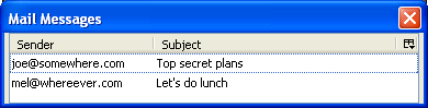
A tree with several columns
<tree flex="1" rows="2">
  <treecols>
    <treecol id="sender" label="Sender" flex="1"/>
    <treecol id="subject" label="Subject" flex="2"/>
  </treecols>
  <treechildren>
    <treeitem>
      <treerow>
        <treecell label="joe@somewhere.com"/>
        <treecell label="Top secret plans"/>
      </treerow>
    </treeitem>
    <treeitem>
      <treerow>
        <treecell label="mel@whereever.com"/>
        <treecell label="Let's do lunch"/>
      </treerow>
    </treeitem>
  </treechildren>
</tree>
A tree with several columns and nested items
<tree id="myTree" flex="1" hidecolumnpicker="false" seltype="single" class="tree"
      rows="5">
  <treecols id="myTree2-treeCols">
    <treecol id="myTree2-treeCol0" primary="true" flex="2" label="Column A"
             persist="width" ordinal="1"/>
    <splitter class="tree-splitter" ordinal="2"/>
    <treecol id="myTree2-treeCol1" flex="1" label="Column B"
             persist="width" ordinal="3"/>
  </treecols>
  <treechildren>
    <treeitem>
      <treerow>
        <treecell label="1"/>
        <treecell label="a"/>
      </treerow>
    </treeitem>
    <!-- Make sure to set container="true" -->
    <treeitem container="true" open="true">
      <treerow>
        <treecell label="2"/>
        <treecell label="b"/>
      </treerow>
      <treechildren>
        <treeitem>
          <treerow>
            <treecell label="2a"/>
            <treecell label="ba"/>
          </treerow>
        </treeitem>
      </treechildren>
    </treeitem>
  </treechildren>
</tree>
Attributes
-
disabled - Type: boolean
-
Indicates whether the element is disabled or not. If this element is set to
truethe element is disabled. Disabled elements are usually drawn with grayed-out text. If the element is disabled, it does not respond to user actions, it cannot be focused, and thecommandevent will not fire. -
Visible controls have a
disabledproperty which, except for menus and menuitems, is normally preferred to use of the attribute, as it may need to update additional state.
-
enableColumnDrag - Type: boolean
- When set to
true, the user may drag the column headers around to change the order in which they are displayed.
flags- Type: space-separated list of the values below
- A set of flags used for miscellaneous purposes. Two flags are defined, which may be the value of this attribute.
dont-test-empty: For template generated content, the builder will not check that a container is empty.dont-build-content: This flag may be used on a tree to indicate that content elements should not be generated. This results in a performance enhancement, but you will not be able to use the DOM functions to retrieve the tree rows.
-
hidecolumnpicker - Type: boolean
- When set to
false, a drop-down will appear in the upper right corner of thetree, which the user may use to show and hide columns. When set totrue, the column picker will be hidden. The default value isfalse.
-
rows - Type: integer
-
The number of rows to display in the element. If the element contains more than this number of rows, a scrollbar will appear which the user can use to scroll to the other rows. To get the actual number of rows in the element, use the
getRowCountmethod.
seltype- Type: one of the values below
- Used to indicate whether multiple selection is allowed.
single- Only one row may be selected at a time. (Default in
listboxandrichlistbox.) multiple- Multiple rows may be selected at once. (Default in
tree.)
For trees, you can also use the following values:
cell- Individual cells can be selected
text- Rows are selected; however, the selection highlight appears only over the text of the primary column.
For
richlistbox, this is new in Firefox 3.5.
statedatasource- Type: URI
- Chrome XUL may specify an RDF datasource to use to store
treestate information. This is used to hold which tree items are open and which items are collapsed. This information will be remembered for the next time the XUL file is opened. If you do not specify this attribute, state information will be stored in the local store (rdf:local-store).
-
tabindex - Type: integer
- The tab order of the element. The tab order is the order in which the focus is moved when the user presses the "
tab" key. Elements with a highertabindexare later in the tab sequence.
-
treelines - Type: boolean
- When set to
true, lines are drawn connecting the lines in the tree; whenfalse, the lines are not drawn. This isfalseby default.
Properties
-
accessibleType - Type: integer
- A value indicating the type of accessibility object for the element.
builderView- Type:
nsIXULTreeBuilder - A reference to the tree builder which constructed the
treedata. The builder provides access to the RDF resources for each row in the tree, and allows sorting the data by column. In newer versions of Mozilla, thebuilderViewproperty is actually a synonym for theviewproperty, since the two interfaces are flattened together into a single interface in JavaScript. This property is read-only.
-
columns -
Type:
nsITreeColumns -
Returns the columns for the tree as an
nsITreeColumnsobject.
-
contentView -
Type:
nsITreeContentView -
For trees built with a content builder - that is, those that do not have
flagsset -- thecontentViewwill be a reference to thensITreeContentViewfor the tree. This interface lets you retrieve the DOM element corresponding to a given a row index and vice versa. For trees that are not built with a content builder, the functions ofnsITreeContentViewwill not be available, since there are no DOM nodes to retrieve. In newer versions of Mozilla, thecontentViewproperty is actually a synonym for theviewproperty, since the two interfaces are flattened together into a single interface in JavaScript. This property is read-only.
-
currentIndex - Type: integer
-
Set to the row index of the tree caret in the
tree. For trees with focus, the caret's position is indicated by the focus ring, but unfocused trees won't show a focus ring, naturally. For unfocused trees, the (undrawn) caret's position can still be obtained by this property. If the caret isn't present for any row (for example, because the tree has never been focused), the value will be-1.You cannot rely on this property to change or determine a tree selection, except for trees with
seltype="single"seltype="multiple"by default.) To reliably change or determine a selection, instead use thensITreeSelectioninterface methods available viatree.view.selection.
editingColumn- Type:
nsITreeColumn - The column of the
treecell currently being edited, ornullif there is no cell being edited.
-
editingRow - Type: integer
- The row index of the tree cell currently being edited, or
-1if there is no cell currently being edited.
-
enableColumnDrag - Type: boolean
- When set to
true, the user may drag the column headers around to change the order in which they are displayed.
-
firstOrdinalColumn - Type:
treecolelement - A reference to the first
treecolelement, which or may not be the first column displayed in the tree.
inputField- Type: textbox element
- Read-only property that holds the
textboxthat is used for editing.
-
selstyle - Type: string
-
If set to the value
primary, only the label of the primary column will be highlighted when an item in the tree is selected. Otherwise, the entire row will be highlighted. To see the difference, compare the selection style in the folder list and the message list in Mozilla mail.
treeBoxObject- Type:
nsITreeBoxObject - The box object is responsible for rendering the
treeon the window. This object implements thensITreeBoxObjectinterface and contains functions for retrieving the cells at certain coordinates, redrawing cells and scrolling the tree. This property is equivalent to theboxObjectproperty.
-
view -
Type:
nsITreeView -
The view for the
tree, which is the object which generates the data to be displayed. You can assign an object which implementsnsITreeViewto this property. Trees built from RDF or those which usetreeitems directly will already have a view. Functions available in the view allow one to retrieve the data within the cells, and determine which rows are nested within others. For a complete list of view functions, see thensITreeViewinterface.
Methods
startEditing( row, column )- Return type: no return value
- Activates user editing of the given cell, which is specified by row index number and the
nsITreeColumnin which it is located. The tree view'snsITreeView.getCellText()method is called to obtain the cell contents.
-
stopEditing( shouldaccept ) - Return type: no return value
- Stops editing the cell currently being edited. If the
shouldAcceptparameter istrue, the cell's label is changed to the edited value (the tree view'snsITreeView.setCellText()method is called to change the cell contents). Otherwise the cell label is reverted to the value it had prior to editing.
Related
- Elements
treecols,treecol,treechildren,treeitem,treerow,treecellandtreeseparator..- Interfaces
nsIAccessibleProvider,nsIDOMXULTreeElement,nsIDOMXULMultiSelectControlElement
Script Examples
To have alternating colors for each row, use the style rules like the following:
treechildren::-moz-tree-row(selected) { background-color: #FFFFAA; }
treechildren::-moz-tree-row(odd) { background-color: #EEEEEE; }
treechildren::-moz-tree-row(odd, selected) { background-color: #FFFFAA; }
treechildren::-moz-tree-cell-text(selected) { color: #000000; }
treechildren::-moz-tree-cell-text(odd, selected) { color: #000000; }
If using a content tree view, use the following to get the value of the id attribute for each of the selected rows of a tree:
var idList = [];
var rangeCount = tree.view.selection.getRangeCount();
for (var i = 0; i < rangeCount; i++) {
  var start = {};
  var end = {};
  tree.view.selection.getRangeAt(i, start, end);
  for (var c = start.value; c <= end.value; c++) {
    idList.push(tree.view.getItemAtIndex(c).firstChild.id);
  }
}
The following returns a array of the indicies of the rows where the value is checked in a checkbox type column:
function getCellChecked(tree, columnid) {
  var arr = [];
  var column = tree.columns.getNamedColumn(columnid);
  for (var i = 0; i < tree.view.rowCount; i++) {
    if (tree.view.getCellValue(i, column) == 'true')
      arr.push(i);
  }
  return arr;
}
To get the text value for a specific column (for example column 'age') from the currently focused row in the tree:
var t = document.getElementById('mytree');
document.title = t.view.getCellText(t.currentIndex,t.columns.getNamedColumn('age'));
To select the checkbox and display the cell's text value, you can use code like the following.
XUL for the tree:
<?xml version="1.0"?>
<?xml-stylesheet href="chrome://global/skin/" type="text/css"?>
<?xml-stylesheet href="file://C:/main.css" type="text/css"?>
<window xmlns="http://www.mozilla.org/keymaster/gatekeeper/there.is.only.xul">
<row><button label="GetRowValues" oncommand="getrowcellvalues();"/></row>
 <tree flex="1" editable="true" id="mytree">
  <treecols>
    <treecol label="Active" type="checkbox" editable="true" />
    <treecol label="Name" flex="1" id="name"/>
  </treecols>
  <treechildren>
    <treeitem>
      <treerow>
        <treecell value="false"/>
        <treecell label="Alice"/>
      </treerow>
    </treeitem>
    <treeitem>
      <treerow>
        <treecell value="false"/>
        <treecell label="Bob"/>
      </treerow>
    </treeitem>
  </treechildren>
</tree>
</window>
CSS:
treechildren::-moz-tree-checkbox {
  /* unchecked checkbox treecells. This style MUST come before treechildren::-moz-tree-checkbox(checked) otherwise it won't take effect. */
  list-style-image: url("")
}
treechildren::-moz-tree-checkbox(checked) {
  /* checked checkbox treecells. cbox-check.gif isn't available in
     Firefox 1, 2, and 3 in Mac OS X so you should specify a URL to an image
     in your extension or elsewhere. */
  list-style-image: url("chrome://global/skin/checkbox/cbox-check.gif");
}
treechildren::-moz-tree-checkbox(disabled) {
  /* disabled checkbox treecells. cbox-check-dis.gif isn't available in
     Firefox 1, 2, and 3 in Mac OS X, so you should specify a URL to an image
     in your extension or elsewhere. */
  list-style-image: url("chrome://global/skin/checkbox/cbox-check-dis.gif")
}
treechildren::-moz-tree-row(selected)            { background-color: #FFFFAA; }
treechildren::-moz-tree-row(odd)                 { background-color: #EEEEEE; }
treechildren::-moz-tree-row(odd, selected)       { background-color: #FFFFAA; }
treechildren::-moz-tree-cell-text(selected)      { color: #000000; }
treechildren::-moz-tree-cell-text(odd, selected) { color: #000000; }
treechildren::-moz-tree-row(hover) {background-color: #FFFFAA !important;}
treechildren:-moz-tree-column {
  border-right:1px solid rgb(220,220,220) !important;
}
The JavaScript to get the text for the selected row/rows:
function getrowcellvalues() {
  var tree = document.getElementById('mytree');
  for (var i = 0; i < tree.view.rowCount; i++) {
    if (tree.view.getCellValue(i, tree.columns.getColumnAt(0)) == 'true'){
      alert(tree.view.getCellText(i, tree.columns.getNamedColumn("name")));
    }
  }
}
This way, you can get the tree cell values of the selected checkbox of the corresponding row.